

[Dec 14, 2025] TDA-C01 Free Exam Questions with Quality Guaranteed
TDA-C01 Free Exam Files Downloaded Instantly
With the popularity of Tableau increasing day by day, obtaining the Tableau TDA-C01 certification can prove to be a valuable asset for data analysts. Tableau Certified Data Analyst certification can demonstrate an individual's expertise and credibility in using Tableau, which is highly desired by employers across different industries. It not only enhances the resume of the individual but also increases their chances of getting higher-paying job opportunities.
NEW QUESTION # 35
A Data Analyst has the following two tables named Orders and Returns.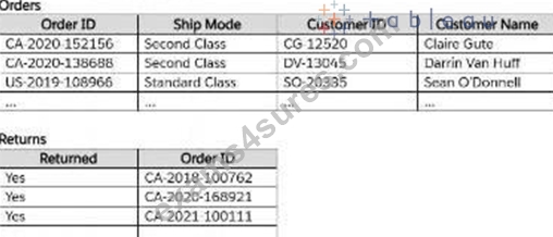
The analyst needs to get the Customer ID and Customer Name for only the orders that were returned. Orders will be the leading table.
Which type of join should the analyst perform in Tableau Prep?
- A. Left join
- B. Inner join
- C. Full join
- D. Unmatched only join
Answer: B
NEW QUESTION # 36
A Data Analyst needs to calculate the first Tuesday of each month in the data.
Which set of functions should the analyst use to perform this calculation?
- A. DATETRUNC, DATEPART
- B. DATEADD, DATENAME
- C. DATEDIFF, DATEPART
- D. DATETRUNC, DATEADD
Answer: A
NEW QUESTION # 37
You have the following chart that shows profits and discounts over time.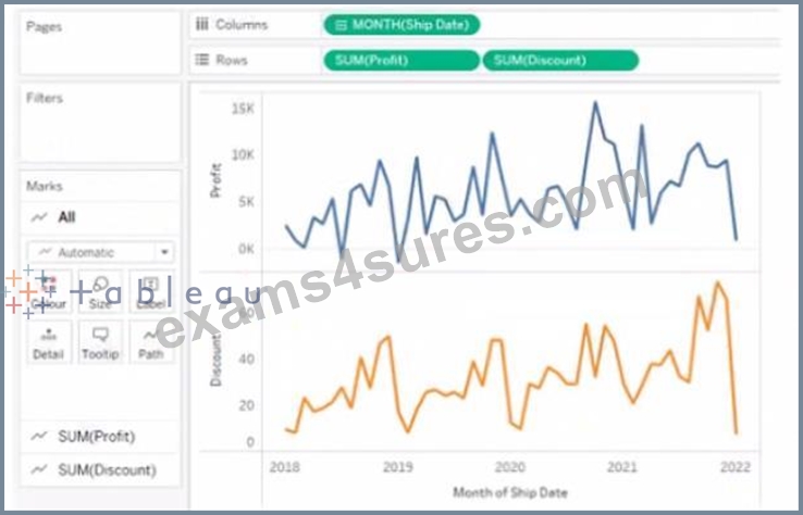
You need to combine the lines to appear as shown in the following chart.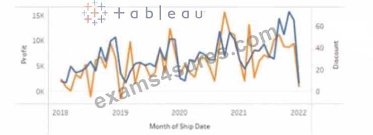
What should you do?
- A. Drag Discount to the Columns shelf
- B. Drag Discount to Color on the Marks card
- C. Set Discount to Dual Axis
- D. Convert Discount to Discrete
Answer: C
Explanation:
To combine the lines to appear as shown in the second chart, you should set Discount to Dual Axis. Dual Axis is a feature that allows you to show two measures on two separate axes on one chart. You can create a dual axis by right-clicking on a measure on any shelf and selecting Dual Axis from the menu. This will create two axes on one chart and synchronize their scales.
In this case, you want to show Profit and Discount on two separate axes on one chart. You can right-click on Discount on any shelf and select Dual Axis from the menu. This will create a dual axis chart that shows Profit and Discount as two lines with different colors.
The other options are not correct for this scenario. Dragging Discount to Color on the Marks card will change the color of Profit based on Discount, but it will not show two lines. Converting Discount to Discrete will change Discount from a green pill to a blue pill, but it will not affect how it appears on the chart. Dragging Discount to Columns shelf will create two separate charts for Profit and Discount, but it will not combine them. References: https://help.tableau.com/current/pro/desktop/en-us/multiplemeasures.htm
https://help.tableau.com/current/pro/desktop/en-us/multiplemeasures_dualaxes.htm
NEW QUESTION # 38
You have the following worksheet.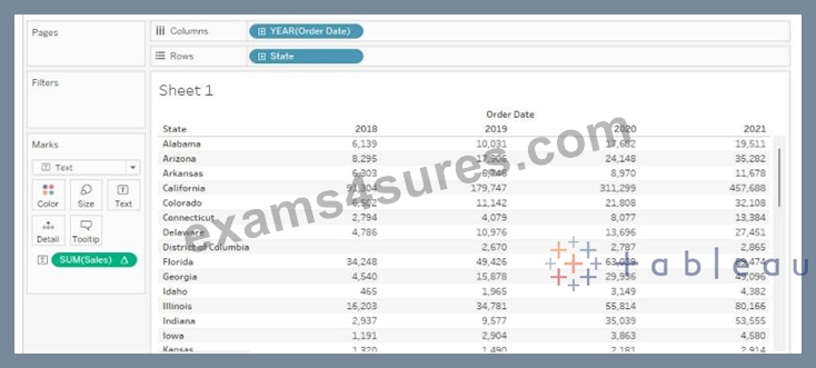
You want to create a table calculation that shows sales growth over each year.
How should you complete the formula? (Use the dropdowns in the Answer Area to select the correct options to complete the formula.)
Answer:
Explanation:
Reference:
Tableau Certified Data Analyst Exam Prep Guide, page 11, section "Creating Calculated Fields" Tableau Help: SUM Function Tableau Help: LOOKUP Function Tableau Help: PREVIOUS_VALUE Function
NEW QUESTION # 39
Open the link to Book1 found on the desktop. Open SalesVSProfit worksheet.
Add a distribution band on Profit to show the standard deviation from- 1 to 1.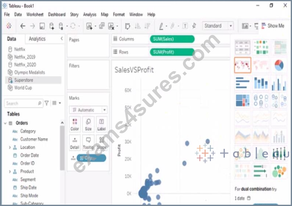
- A. check the steps below in explanation
Answer: A
Explanation:
To add a distribution band on Profit to show the standard deviation from -1 to 1, you need to do the following steps:
Open the link to Book1 found on the desktop. This will open the Tableau workbook that contains the SalesVSProfit worksheet.
Click on the SalesVSProfit tab at the bottom of the workbook to open the worksheet. You will see a scatter plot that shows the relationship between Sales and Profit for each Sub-Category.
Click on the Analytics tab on the left side of the workbook to open the Analytics pane. You will see a list of analytical objects that you can drag and drop onto your worksheet.
Drag Distribution Band from the Analytics pane to Profit on the Rows shelf. This will add a distribution band on Profit that shows the average and confidence interval for each Sub-Category.
Click on the Edit button on the distribution band to open the Edit Distribution Band dialog box. You will see options to customize your distribution band.
Change the Band From value to -1 and the Band To value to 1. This will change the distribution band to show the standard deviation from -1 to 1, which means one standard deviation below and above the average.
Click OK to apply the changes. You will see that the distribution band now shows a narrower range of values for Profit.
NEW QUESTION # 40
You have the following table.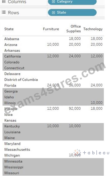
You need each record to alternate between grey and white.
What should you change in the Format Shading pane?
- A. the row banding size to 1
- B. the column banding size to 1
- C. the column banding size to 3
- D. the row banding size to 3
Answer: A
NEW QUESTION # 41
You have a data source that has two tables named Table1 and Table2. Table1 is the primary table and Table2 is the secondary table.
You want to combine the tables by using Tableau Prep. The combined table must include only values from Table1 that do NOT match any values in Table2. The field values from Table2 must appear as null values.
Which type of join should you use?
- A. Full outer
- B. Left
- C. Union
- D. Inner
- E. Left only
Answer: E
Explanation:
To combine the tables by using Tableau Prep and include only values from Table1 that do not match any values in Table2, you should use a left only join. A left only join is a type of join that returns only the rows from the primary table (Table1) that have no matching rows in the secondary table (Table2). The field values from Table2 will appear as null values in the combined table. A left only join is also known as an anti-join or an exclusion join. Reference:
Tableau Certified Data Analyst Exam Prep Guide, page 9, section "Preparing Data" Tableau Help: Join Your Data Tableau Help: Left Only Join
NEW QUESTION # 42
You subscribe to a view that delivers a daily email to your inbox.
You want to make the subscription available to other stakeholders.
What should you do?
- A. From the My Content overview page, modify the subscription.
- B. From the My Content overview page, modify the alert.
- C. From the dashboard overview page, modify the subscription.
- D. From the worksheet, modify the subscription.
Answer: A
NEW QUESTION # 43
A Data Analyst has the following chart that shows the sum of sales made in different cities.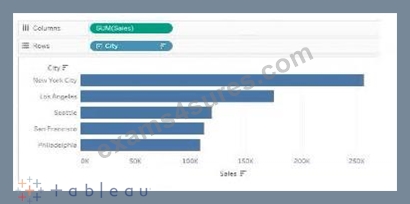
The analyst wants to show the average sale amount for a city when users hover their mouse over any of the bars.
What should the analyst do?
- A. Drag Sales to Tooltip on the Marks card and modify the Tooltip text.
- B. Right-click on SUM(Sales) in the Columns and select Include in Tooltip.
- C. Right-click on SUM(Sales) in the Columns and change Aggregation to Average.
- D. Drag Sales to Tooltip on the Marks card and change Aggregation to Average.
Answer: D
NEW QUESTION # 44
You have the following tiled dashboard that has one sheet.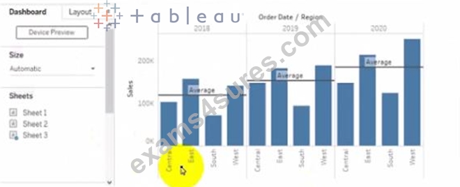
You want to replace fit sheet with Sheet2.
What should you do?
- A. Right-click Sheet2 and select Add to Dashboard.
- B. From the context menu of Sheet3. select Remove Dashboard item
- C. From the context menu of Sheet3. select Deselect
- D. Drag Sheet2 to the dashboard.
- E. Select Sheets and click the Swap Sheet button next to Sheet2.
Answer: E
Explanation:
To replace a sheet on a tiled dashboard, you can simply drag the new sheet from the Sheets pane to the dashboard and drop it over the existing sheet. This will replace the old sheet with the new one and keep the same size and position. Alternatively, you can right-click on the old sheet and select Replace Data Source, then choose the new sheet from the list. Reference: https://help.tableau.com/current/pro/desktop/en-us/dashboards_organize_floating_layoutcontainers.htm https://help.tableau.com/current/pro/desktop/en-us/dashboards_replace_datasource.htm
NEW QUESTION # 45
You have a dashboard that contains confidential information about patients health. The data needs to always be up to date tor a team of healthcare workers How should you share me dashboard with the healthcare workers?
- A. Export the dashboard as a .twbx
- B. Publish the dashboard to Tableau Public
- C. Print the dashboard to PDF
- D. Publish aw dashboard to Tableau Server
Answer: D
Explanation:
To share a dashboard that contains confidential information about patients health and needs to always be up to date for a team of healthcare workers, you should publish it to Tableau Server. This will allow you to control who can access and interact with your dashboard, as well as schedule automatic refreshes of your data source or extract. Publishing to Tableau Public would expose your data to anyone on the internet, printing to PDF would not update your data, and exporting as a .twbx would require sending a large file that might not be compatible with other versions of Tableau. Reference: https://help.tableau.com/current/pro/desktop/en-us/publish_workbooks_share.htm https://help.tableau.com/current/pro/desktop/en-us/publish_workbooks_tableauserver.htm
NEW QUESTION # 46
Open the link to Book1 found on the desktop. Open the sales dashboard.
Add the Sales by State sheet in a Show/Hide button to the right side of the dashboard.
Answer:
Explanation:
Send us your feedback on it
NEW QUESTION # 47
You have a workbook that connects to a database. The database requires authentication.
You plan to publish the workbook and schedule a daily refresh of the data.
Which two conditions must be met to schedule the refresh? Choose two.
- A. The data source must be stored as a hyper file.
- B. The data must be extracted.
- C. The data source must use a live connection.
- D. The credentials must be embedded.
Answer: B,D
Explanation:
To schedule a refresh of the data, you need to ensure that Tableau Server or Tableau Online can access the database without prompting for credentials. This can be done by embedding the credentials in the workbook or the published data source. You also need to extract the data from the database and publish it as a separate data source or as part of the workbook. A live connection would not allow you to refresh the data on a schedule, as it would always query the database directly. A hyper file is a format for storing extracted data, but it is not a requirement for scheduling a refresh. References:
* Tableau Certified Data Analyst Exam Prep Guide, page 10, section "Publishing and Scheduling Data Refreshes"
* Tableau Help: Embedding Database Credentials
* Tableau Help: Extract Your Data
NEW QUESTION # 48
A Data Analyst has a dataset that contains people and the awards they have won.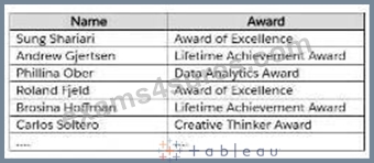
Which formula should the analyst use to get the number of different types of awards that have been won?
- A. COUNT ( [Award] )
- B. COUNTD ( [Award] )
- C. WINDOW_COUNT ( [Award] )
- D. COUNTD ( [NAME] )
Answer: B
NEW QUESTION # 49
You have the following visualization.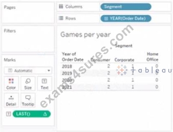
The Last() calculation is set to compute using Table (across)
Which value will appear in the crosstab for the Consumer segment of the year 2018 if you change compute to use Oder Dale?
- A. 0
- B. 1
- C. 2
- D. 3
Answer: C
Explanation:
The LAST() function in Tableau returns the number of rows from the current row to the last row in the partition. When you compute using 'Order Date', it will change the partitioning of the calculation. If
'Consumer' in '2018' is the last row in its partition when computed by 'Order Date', then LAST() will return 0 for that cell.
The LAST() function in Tableau is a table calculation that returns the number of rows from the current row to the last row in the partition. The value of LAST() is 0 for the last row, increases by 1 for each row above the last row, and can be negative for rows below the current row if there are such rows in the partition.
In the provided visualization, LAST() is set to compute using Table (across). Changing the compute mode to use "Order Date" will adjust the partitioning of the data upon which the LAST() function is calculated. Since
"Order Date" is likely to be a unique value per row (assuming each order has a unique date), each row becomes its own partition.
For the Consumer segment of the year 2018, if "Order Date" is unique for each row, then the last row in each partition (in this case, each individual row) will have a LAST() value of 0 because there are no other rows in the partition - it's the last row of its own partition.
Therefore, when you change the compute mode of LAST() to use "Order Date", each cell under the Consumer segment for the year 2018 will have the LAST() value of 0, because each order date creates a partition of one, making every row the last in its partition.
NEW QUESTION # 50
You have the following Map.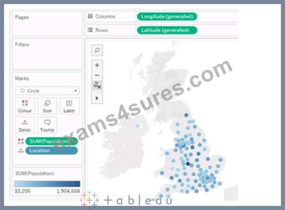
You need the map to appear as shown in the following visualization.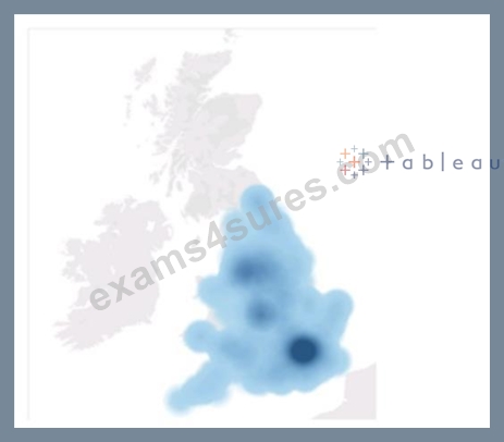
What should you do?
- A. Drag Population to Size on the Marks card.
- B. Change the mark type to Density.
- C. Drag Location to Size on the Marks card.
- D. Change the opacity to 75%.
- E. Change the mark type to Map.
Answer: B
Explanation:
To create a map visualization that shows the concentration of data points in different locations, you need to change the mark type to Density. This will create a heatmap that uses color and size to indicate the density of the data points. You can also adjust the intensity and transparency of the density marks to suit your needs. References: The information is based on the following sources:
Create Heatmaps that Show Trends or Density in Tableau
Build a Simple Map - Tableau
NEW QUESTION # 51
You have the following map.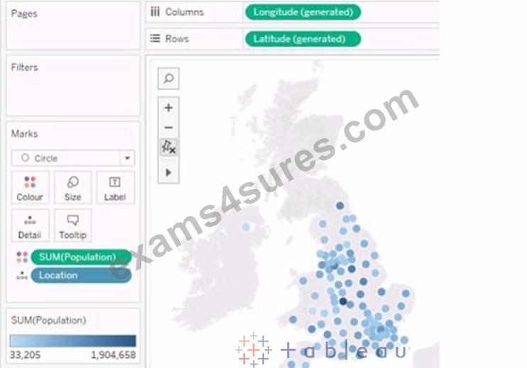
You need the map to appear as shown in the following visualization.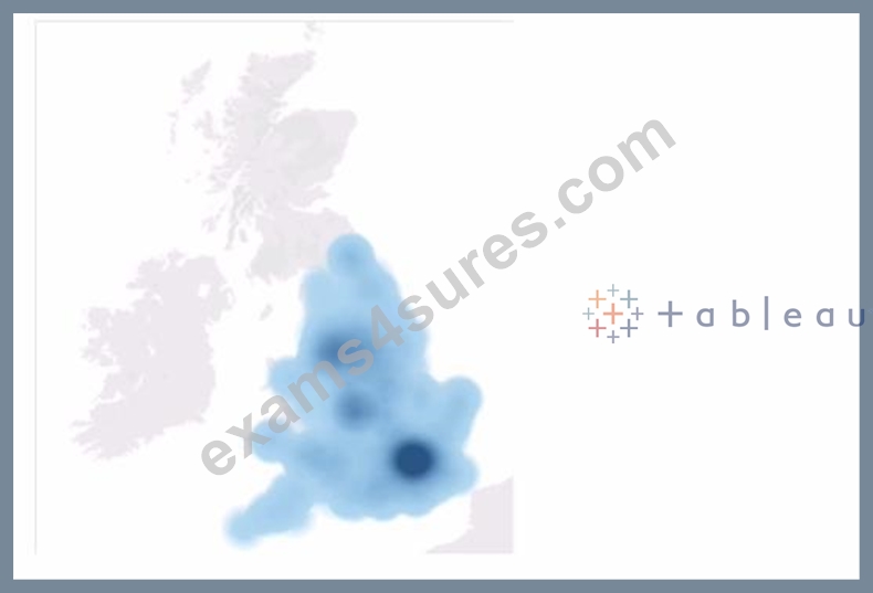
What should you do?
- A. Change the mark type to Map
- B. Change the opacity to 75%
- C. Drag Population to Size on the Marks card
- D. Change the mark type to Density
- E. Drag Location to Size on the Marks card
Answer: D
Explanation:
The question presents a scenario where a geographic map visualization in Tableau needs to be transformed from a series of discrete circles representing data points to a density map visualization. The density map shows concentrations of data points with a gradient of color, where denser areas are indicated by a darker color.
Here's the explanation for each option:
A). Change the mark type to Density: This is the correct answer because changing the mark type to 'Density' in Tableau creates a density map, which displays the concentration of data points with a color gradient. This is exactly what is needed to achieve the visual effect shown in the second image, where regions with a higher concentration of data points are represented by darker shades.
B). Drag Location to Size on the Marks card: This option would adjust the size of the marks based on the number of locations, which is not relevant to creating a density map. It would result in varying sizes of circles, not a continuous gradient.
C). Change the mark type to Map: The visualization is already using a map. This option would not change the visualization to the desired density map.
D). Drag Population to Size on the Marks card: This would change the size of the circles based on the population values, making some circles larger and others smaller. This is not how a density map is created, which uses color intensity rather than size to show concentration.
E). Change the opacity to 75%: Changing the opacity would affect the transparency of the marks on the map but would not transform the visualization into a density map.
To achieve the visualization shown in the second image, the mark type must be changed to 'Density,' which will produce a heat map-like effect where the color intensity represents the concentration of data points.
Therefore, the correct answer is A. Change the mark type to Density.
To create a density map from a scatter plot of data points, you would change the mark type to Density. This mark type allows you to visualize the concentration of data points in an area, which can be useful for identifying clusters or patterns in geospatial data.
NEW QUESTION # 52
In a dataset, you have a string field named Name that contains unnecessary semicolons.
Which function should you use to remove the semicolons from the Name field?
- A. TRIM
- B. CONTAINS
- C. REPLACE
- D. SPLIT
Answer: C
Explanation:
The REPLACE function is used to replace all occurrences of a substring within a string with another substring. In this case, it can be used to remove the semicolons from the Name field by replacing them with an empty string. For example, REPLACE ("John;Doe", ";", "") = "JohnDoe". Reference: The information is based on the following sources:
String Functions - Tableau
Remove special characters and add a semi colon in a word - Tableau
NEW QUESTION # 53
......
Q&As with Explanations Verified & Correct Answers: https://www.exams4sures.com/Tableau/TDA-C01-practice-exam-dumps.html
Practice Exams and Training Solutions for Certifications: https://drive.google.com/open?id=1DZ1lVS_TzneJXK08bQo02kLuc0BuUWOQ